Ask John: What Explains the Color Design of 80’s Anime?

Question:
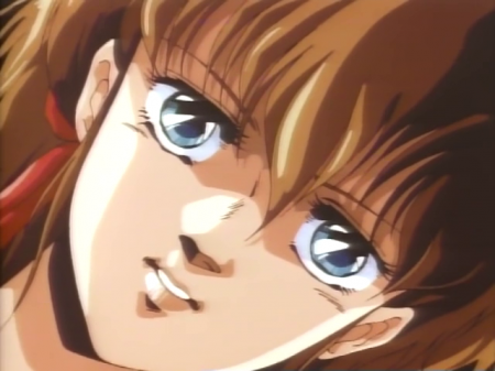
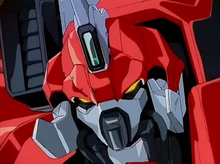
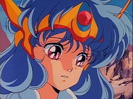
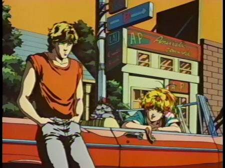
hy was 80’s anime so shiny? Examples include Machine Robo Revenge of Chronos, Macross (especially DYRL), Orguss, Birth, M.D. Geist, Dancougar, Zeta/ ZZ Gundam (compare the shiny/shaded mobile suits of that to the flat coloring of V and G-Gundam), Fight Iczer-1, Dangaioh, Megazone 23, Cream Lemon: Summer Wind and White Shadow (the ones Satoshi Urushihara worked on) and the Five Star Stories movie. What brought about that stylistic look that eventually went away in the 90s, although anime such as Gurren Lagann and Star Driver have use that look in some scenes to give the mecha an aggressive glossy look?
I’m not an animator, yet I think I can explain this particular characteristic of Golden Era anime. Rather than call a lot of 1980’s anime “shiny,” a more accurate adjective would be “high contrast.” The use of bright, crisp colors that virtually “popped” off the screen are particularly evident in 80’s OVAs and movies including Megazone 23, Windaria, Fandora, Bubblegum Crisis, Shin Cream Lemon: White Shadow, and the Macross movie. From the 1950s through 70s, film stock technology and television projection weren’t fantastic, so most anime from the era have muted color palates. The early 1980s, however, introduced video technology and significant improvements in film technology. New film stocks and recording technology coupled with the bigger budgets of the golden era allowed animators to experiment with brighter colors and utilize greater color depth and contrast than previously possible. As a result, anime productions like Birth, Cool Cool Bye, and California Crisis emerged that were virtually animated experiments in vivid color design.
The 1990s brought with them the advent of digital coloring. Software programs like Painter allowed anime artists to access an even greater range of colors, and color images more swiftly and conveniently. However, the era of digital animation created a hybrid of the Golden Age and its ancestor. The 1990s to the present introduced an era in which the convenience of digital coloring and the variety of color shades available to animators allowed for more natural color gradients and perfect digital color consistency, resulting in crisp, computer generated colors with less fantastic, clashing contrast and less of the sort of hand-spun color shades that appeared when the paints used to color anime were poured, mixed, and painted by hand. For just that singular decade, the Golden Era of the 1980s, a perfect storm of advancing analog technology and enough money to spare to allow for creative indulgence inspired the development of a distinctive visual aesthetic for anime that hadn’t existed before and has only infrequently reappeared since, usually in conscious homage productions like Usagi-chan de Cue (2001), Mnemosyne (2008), and Red Line (2009).


