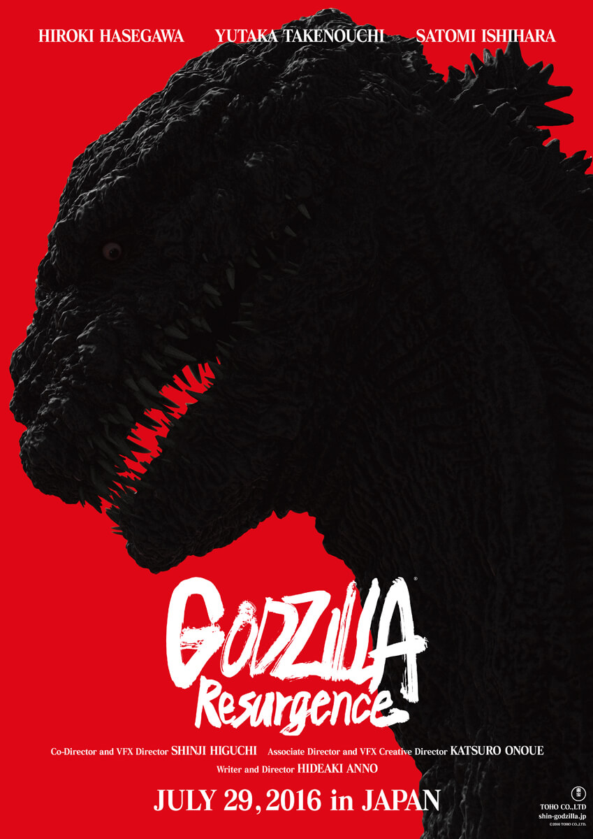
Kaiju or Just Plain Monster?
Now that I finally examine it closely I understand what unsettles me about the Godzilla design depicted by the Shin Godzilla teaser poster. Unless the kaiju happens to have his neck turned at an angle that’s obscured by darkness, his head seems to be too small, too squat. Certain mammals have small heads with short snouts like that, but lizards don’t have such stubby snouts. Moreover, his eyes seems to be set just a slim bit too close to the tip of his nose. The eyes being set so far forward in the cranium gives him a humanoid appearance that’s unnerving and unnaturally uncanny. And lastly his mouth is far too large. As if he’s some bizarre type of flounder instead of a lizard, his mouth extends far beyond his eye sockets, as if he could virtually tilt his entire head open 180 degrees like a blooming flower. If the point is to make Godzilla look monstrous, the design works because he doesn’t exactly look like any natural living creature. Unfortunately, he actually looks like a realistic design of some disposable Ultraman monster of the week, and not in a stylish Nirasawa/Amemiya-like realism.
Add a Comment
You must be logged in to post a comment.


What, you expected actual taste from Hideously Annoyingu?
If this is the actual final design for Godzilla, god save them if the movie is not ‘out of the park’. The biggest problem with Matthew Broderick’s Godzilla movie, is that the monster wasn’t Godzilla. Guess we will have to see how far off the beaten path they are taking this. I want to see a giant monster movie, not a horror movie.